
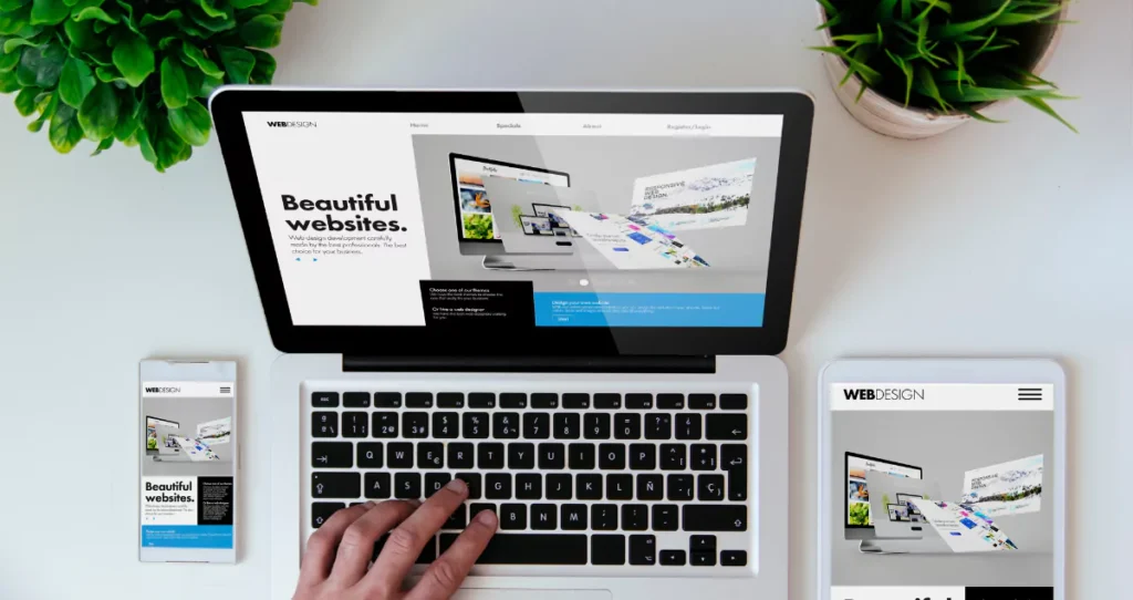
Responsive Web Design Principles: A Simple Guide to Smarter Websites
A strong website needs more than good content. It needs to look great and function well on every screen, no matter the size. This is where responsive web design principles come into play. They form the foundation for creating digital experiences that are easy to navigate, fast to load, and visually consistent across all devices.
Today, most people browse the internet using phones or tablets. If your site is not mobile-friendly, you risk losing traffic, leads, and revenue. Responsive design helps your website stay connected and efficient across all devices. It improves user experience, boosts traffic, supports SEO, and builds trust.
At Sparktivo, we create custom websites that adapt to every screen, deliver real results, and reflect your brand perfectly.
Why Responsive Web Design Matters

We live in a multi-device world. People use smartphones at work, tablets at home, and desktops in offices. A single user may switch between devices throughout the day. A modern website must perform well on all screen sizes, not just one.
If a site looks messy or is hard to use on a mobile device, people will leave within seconds. This is called a high bounce rate. When Google sees this, it lowers your website’s search ranking. That means fewer people will find your site through search engines.
Responsive web design ensures your site looks clean, loads quickly, and is easy to navigate on any screen. It helps with mobile optimization and improves cross-device compatibility. It increases session duration and reduces bounce rates. These small, technical improvements have a major effect on business outcomes.
Making your site responsive is not just about user experience—it’s also about improving your digital presence and visibility.
Want to attract more mobile users? Make your site responsive today.
Flexible Grids and Layouts

The foundation of any responsive design is a flexible layout. Rather than using fixed units like pixels, responsive layouts rely on fluid grids that use percentages. This means that the content on your website will stretch or shrink depending on the user’s screen size.
For example, a traditional desktop website might have three columns. On a mobile device, those columns stack into a single vertical layout. The structure remains clear and logical, but it fits the smaller screen naturally.
Flexible layouts make websites easier to read and interact with. They eliminate the need for zooming or horizontal scrolling. They keep everything aligned and visually pleasing. Designers must plan their layout structure with care, organizing content into grids that behave well under different resolutions.
With flexible layouts, users get a seamless experience, and your brand maintains a professional look across all devices.
Media Queries Make It Happen

Media queries are the code snippets that make responsive web design work. They are like condition checks that ask, “What is the screen width right now?” Based on that answer, the browser can show different styles.
Media queries allow designers to define breakpoints—specific screen sizes where the layout changes to better fit the device. For example, at 768 pixels, the site might switch from a tablet view to a mobile view. At 1024 pixels, it may adjust to fit a desktop.
This helps designers control font sizes, margins, images, and even which elements appear. You might want to hide complex graphics on mobile to improve load times, or show a larger navigation menu on desktop.
Media queries make your site adaptable, clean, and user-friendly. They are a vital tool in responsive web development.
To see media queries in action, try resizing your browser window on a well-built responsive site. Watch how everything adjusts to maintain readability and style.
Flexible Images and Media

Images and media files can make or break your design. If they are too large or not scaled properly, they will ruin the layout on smaller screens. That’s why you need responsive images that adapt to screen size.
Use the CSS rule “max-width: 100%” to make images scale down naturally within their container. This makes sure that an image never stretches beyond its boundary, avoiding overflow and visual clutter.
You can also use HTML’s “srcset” attribute to provide different image sizes for different devices. This helps speed up loading times and saves mobile users from downloading unnecessarily large files.
Video players, infographics, and other media should also scale responsively. This improves website responsiveness and helps your site load faster on all devices.
Responsive images are essential for performance and user experience. They support adaptive content strategies and improve the site’s mobile usability.
The Mobile-First Approach

Designing mobile-first means starting your design process with the smallest screen in mind. Instead of building for desktop and shrinking down, you begin with mobile and scale up.
Why? Because designing for mobile forces you to focus on what matters. Mobile screens have less space, so you need to prioritize the most important content and features. You create a simple, fast, and clean design.
Once your mobile version works, you add enhancements for larger screens. This way, your core design stays solid and lightweight, even when expanded.
Mobile-first websites perform better. They load quickly, reduce clutter, and provide better performance. Google also favors mobile-first sites in search rankings.
In a world where mobile traffic makes up over 60% of total web traffic, this strategy makes sense.
Want a high-speed site that works everywhere? Go mobile-first with Sparktivo.
Common Mistakes in Responsive Design

It’s easy to say a site is responsive—but poorly done responsive design can cause more harm than good. Here are common mistakes to avoid:
- Overloading the site with heavy images and video that do not scale.
- Ignoring mobile testing or only checking on desktop.
- Using buttons or text that are too small to tap or read.
- Creating confusing navigation or menus that don’t translate well to smaller screens.
- Forgetting to optimize form fields for mobile users.
Another mistake is designing for one device and assuming it works for all. Always test your website on multiple devices and browsers.
Poor responsive design affects mobile SEO, user engagement, and conversions.
Avoiding these issues means better performance and happier users.
Top Tools for Building Responsive Sites
You don’t need to reinvent the wheel to build a responsive website. Many tools can help streamline the process:
- Bootstrap: A powerful CSS framework that includes a mobile-first grid system and responsive utilities.
- Tailwind CSS: A utility-first CSS framework great for customizing responsive designs quickly.
- Figma: A design tool that allows for responsive mockups and breakpoints before development begins.
- Chrome DevTools: Built-in browser tools that simulate devices and screen sizes for testing.
- BrowserStack: A cross-browser testing tool that lets you preview your site on real devices.
These tools simplify layout testing, design previewing, and code debugging. They improve workflow and help developers follow best practices for adaptive design.
How Sparktivo Builds Responsive Websites That Convert
At Sparktivo, we don’t just build beautiful websites—we build websites that grow your business.
We begin every project by understanding your users. What devices do they use? What are their behaviors and pain points? Then, we design with performance, speed, and usability in mind.
We apply all core responsive web design principles: flexible layouts, media queries, scalable images, and mobile-first strategies. We test across platforms and continuously optimize for better engagement.
Our responsive websites are crafted with UX-first principles. They load fast, adapt smoothly, and convert visitors into customers.
We use modern tools, follow front-end frameworks, and track performance metrics after launch to refine the experience.
Want a site that brings in leads and adapts to every screen? Let Sparktivo help you.
About Sparktivo
Sparktivo is a digital transformation agency based in Dubai. We specialize in building scalable, high-performance web and mobile experiences for modern businesses.
From responsive websites to full-stack development, we help companies improve their online presence, reach new audiences, and grow faster.
We use platforms like Salesforce, Shopify, AWS, and HubSpot to deliver complete business solutions. Whether you need a new website or a full digital revamp, our team can bring your vision to life.
Our services include design, development, automation, marketing tools, and more. We combine strategy with technology to help your business thrive.
Let’s build something incredible together. Partner with Sparktivo.
Real Example: A Success Story
A regional e-commerce company approached us with a problem. Their website was slow, cluttered, and not mobile-friendly. Over 70% of their users came from mobile, but bounce rates were high.
We redesigned their site using responsive web design principles. First, we created a mobile-first structure. We removed unnecessary content, used flexible grids, and optimized images.
We applied media queries and adaptive layouts that matched each device. Then, we integrated analytics to monitor performance and user behavior.
Within two months, load time improved by 45%, bounce rates dropped by 50%, and conversions increased by 65%.
That’s the power of responsive web design done right.
Want results like this? Schedule a call with Sparktivo today.
Conclusion
Responsive web design is no longer optional—it’s essential.
A site that looks and works great on every screen builds trust, drives engagement, and grows your business. It improves SEO, reduces maintenance, and supports a better digital experience.
By applying smart responsive web design principles, your site can succeed in today’s competitive online world.
At Sparktivo, we help brands create websites that adapt, perform, and scale. We use the latest tools and best practices to deliver results.
Don’t let your outdated website hold you back. Contact Sparktivo for a responsive website audit today.